Over the past several years, we’ve seen brands make a big shift toward simplicity and sleekness. Hooray for minimalism, but this shift has also scrubbed the defining color, complexity of form, and dimensional elements from countless brand palettes, some highly discussed Pentagram rebrands among them.
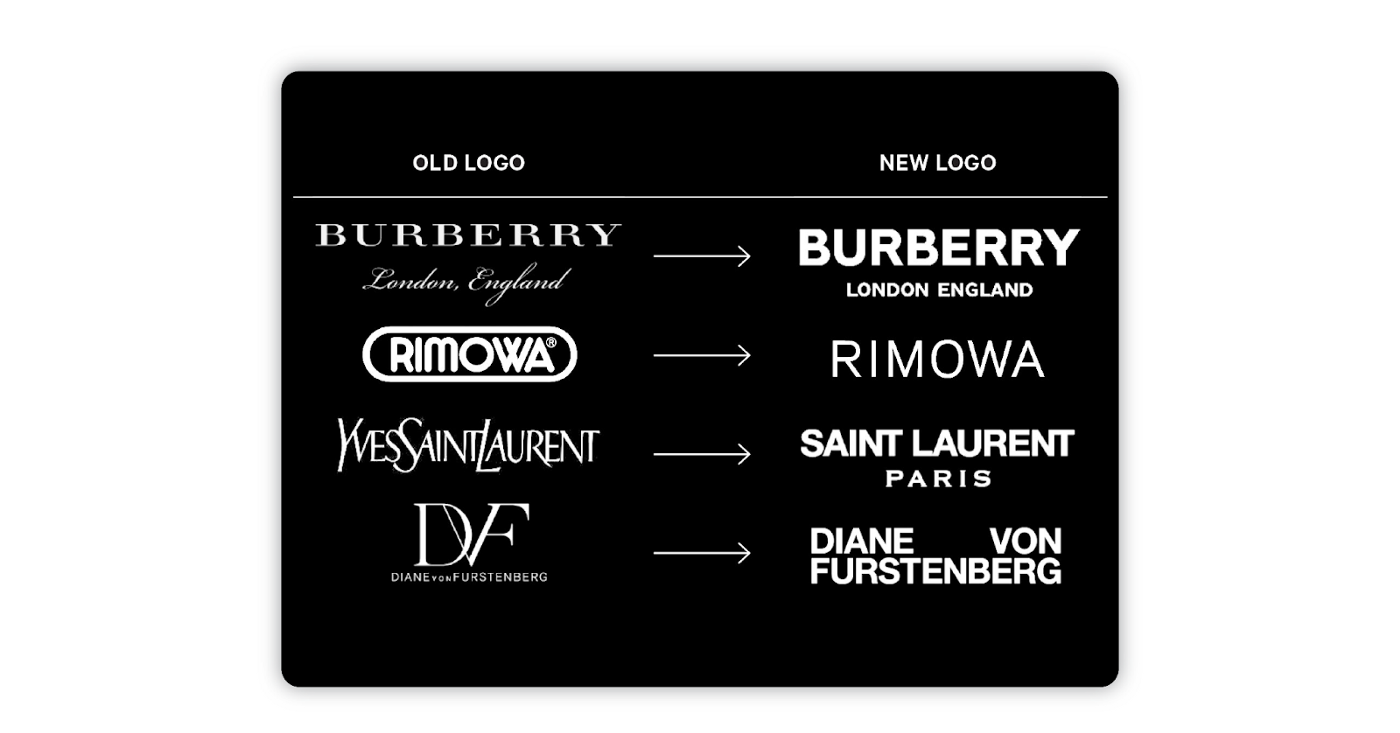
Even luxury fashion brands that have long been iconic for their use of defined, elegant serifs have taken to more simplistic san-serif lockups. They’re trading an iconic logo for better readability and scale, which makes sense as they adjust to pandemic-era digital-first business models.

This shift toward graphic minimalism is reflected in all kinds of design choices: flattening of dimensional graphics, preference for san-serifs, and simplified logos across lots of industries. Hey, even your hometown McDonalds has shifted from featuring as many clown colors as possible to embodying a synergetic corporate cafeteria.
And that’s all good — I am certainly not interested in being prescriptive or moralistic about trends in style.
However, the consequence of “simplifying” is different for design centered around usability.
The “flat” UI trend seems to signify some sort of aesthetic modernity, but the interface loses important visual information.
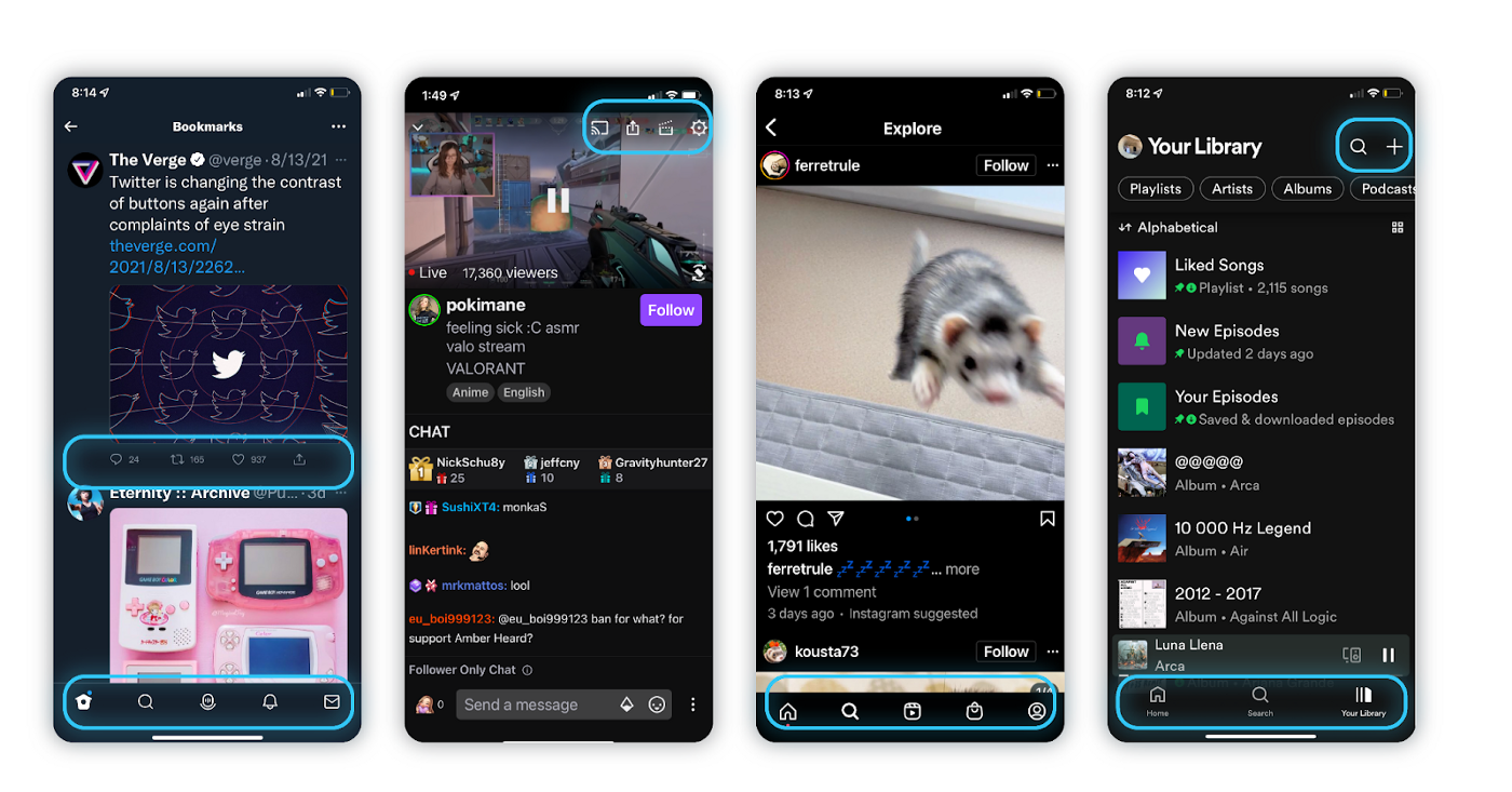
For instance, the thinly outlined icon buttons across prominent tech apps mess with the design hierarchy and helpful interaction cues from their interfaces.

Buttons, form fields, and other interaction elements used to be clearly defined using indicators like dimensional elements, drop shadows, or at least planes of identifiable color. It’s increasingly difficult to discern the interactive elements from static decorative content.
With a lack of hierarchy comes a loss of visual information. In prioritizing style over functionality and clarity of intent, we make our products more difficult to use.
As tech brands scale and expand their presence onto a vast number of online spaces and hardware surfaces, the intention may be to universalize visual language across platforms. However, a thinly outlined icon set intended for non-interactive, static designs might be very successful in its intended use case, but fall flat in its ability to provide contrast, design hierarchy and helpful interaction cues in a user interface scenario.
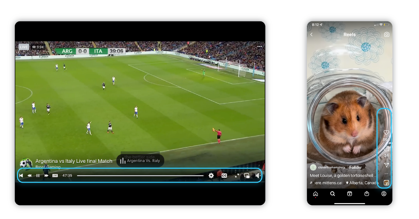
This is especially true as many interfaces begin to roll out dark mode capabilities without adjusting interaction components for a lower contrast environment, some of which are wholly automated by operating systems without oversight by designers. These thinly outlined buttons also seem to particularly get lost when overlaid on video or image content.

There are, of course, outliers to this trend as well. Google continues to champion clarity and accessibility with its latest Material Design initiatives, urging users to design with the latest accessibility guidance, adopt a new rollout of more legible icons with flexible weights, implement use of dynamic color, and even providing open source dark themes with design considerations already taken and accessibility resources to their community.
Even without striving toward the clarity of a definitive design hierarchy, any UI design can and should be an inclusive and accessible experience for all users, including those who have visual, motor, auditory, speech, or cognitive disabilities.
So here are a few best practices for accessible content:
- Use alt text on all images, icons and visual content to create an inclusive experience for those using screen readers
- Implement hierarchy tags (H1, H2, H3…) for ease of navigation and understanding on assistive devices
- Ensure that keyboard navigation is supported (Try it out! Navigate using only your “tab” key)
- Use a color contrast checker to ensure your graphics and text are legible
- Add closed captions to video content
- Add descriptive labels to buttons and use descriptive hyperlinks
And a few ways we can push these practices further:
- Good alt text doesn’t just describe what’s in the image, but also any context a user might miss out on by not being able to see it themselves. For example: I recently encountered a user that was incredibly confused by the red flag viral twitter trend because the short code for the red flag emoji is “:triangular_flag_on_post:”
- Label form field inputs OUTSIDE of your editable field. Assistive devices like screen readers often skip over this information.
- Don’t rely on color alone to communicate critical information. Consider your users with vision impairments, including color blindness.
- Include people with disabilities and those using assistive devices in your user research, and implement their considerations in your design, even when they are not the majority findings.
As those designing for platforms that, in the scheme of human history, are relatively new, we are learning and improving on our knowledge all the time. As designers, we should consider that striving for clarity of information and the most inclusive experience we can design isn’t just a style choice, it’s our responsibility to our users.
For further reading, check out the W3C Web Content Accessibility Guidelines (WCAG) — there is a wealth of information here, but it is, understandably, a little overwhelming.
