
The new year brought a new look for Wikipedia. In January, the website that serves our late night curiosities, showcases which notable people are from your hometown, and definitely doesn’t help with college essays, launched a new update to its page layout.
The Wikimedia Foundation cited its 22nd birthday as a moment to unveil a series of updates to the site, for the first time in 10+ years — so, clearly, it was overdue.
Background
The community that sees 300,000+ contributing editors and 1.7+ billion unique devices each month (per the Wikimedia Foundation) should include an experience that, as Wikimedia describes, “is welcoming and easier to use for everyone.” The changes aren’t over-the-top, and may even go unnoticed by a typical user, but are integral to how people navigate and read the site.
Digital presence
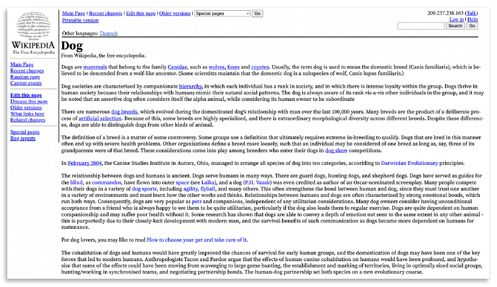
Wikipedia isn’t usually grouped in with the tech giants that dominate the online landscape. There’s no W in FAANG. But it’s just as ubiquitous and just as embedded into our daily lives. The site is built to deliver easy access to human knowledge, which means the experience is more important than any technical innovation — the image above contains five different page layouts that span ~22 years, with only incremental changes happening over that time. That’s key — Wikipedia shouldn’t change drastically. The utility of the experience is what matters.
It might feel like a relic, but it works, the same way that Craigslist hasn’t diverted from its classic web 1.0 aesthetic, Arial type, and purple peace sign favicon. Wikipedia and Craigslist aren’t rolling out new features to make their platform more addictive, or to optimize the placement of ads throughout its pages. They’re more interested in sustaining basic utility, and upholding their communities’ values.
Overview of changes
So with technical innovation and corporate interest set aside, what tactical design changes could actually make a difference? Let’s go through four of the main updated layout features and see what they did right (you can read all of them here).
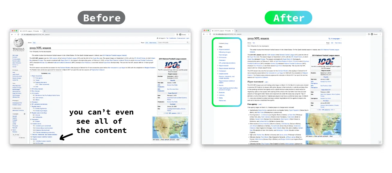
1. Table of contents
I’m saving the best for first — the table of contents uses sticky positioning, so it’s always on screen, no matter where you are on the page. This is so helpful for easily jumping around sections, especially on extremely long pages.
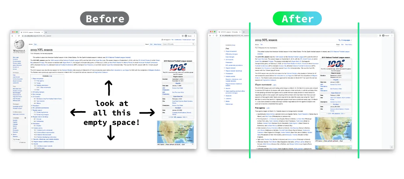
2. Line width
Reading becomes difficult when it spans an entire page width, especially when mobile experiences have conditioned us to read up and down, rather than side to side. This update, which includes a maximum line width and increased default font size, enhances the reading experience and retention of content. Plus it gives more prominence to the accompanying photo.
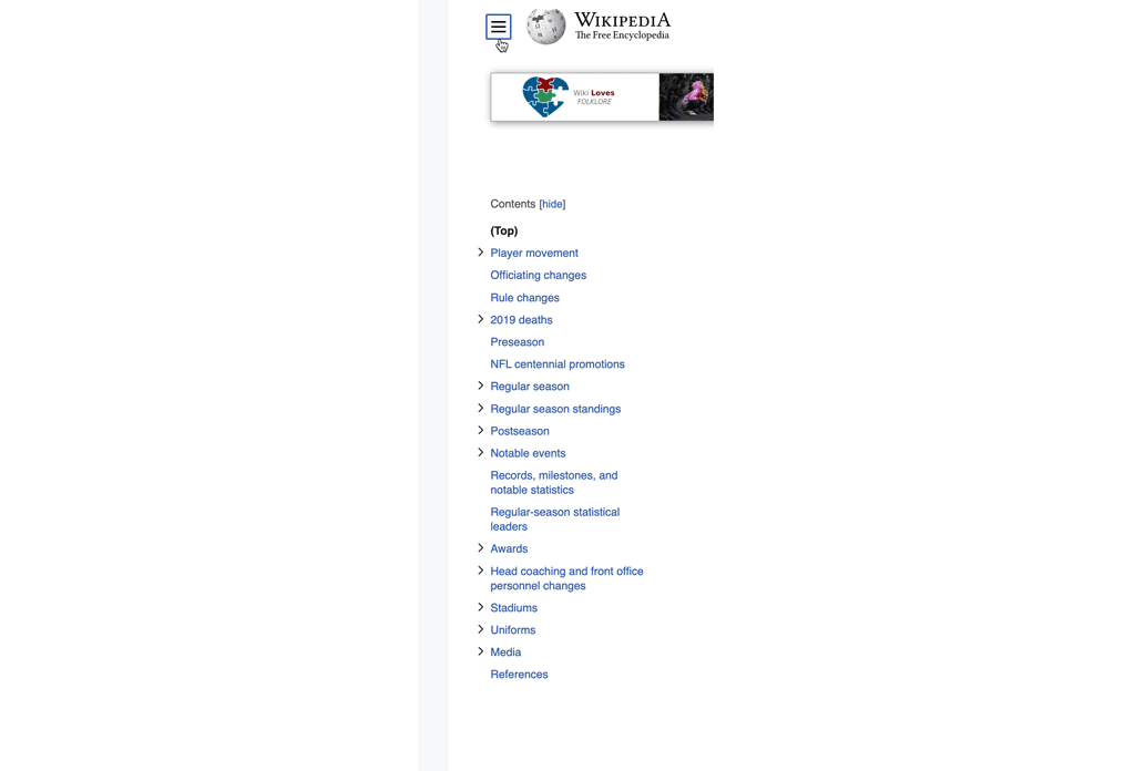
3. Collapsible menu
You don’t always need the universal page menu. With this update, the menu can be collapsed and expanded as needed by the user. This page content has always been secondary, and now it’s been eliminated from default view (unless you really want to see it!).
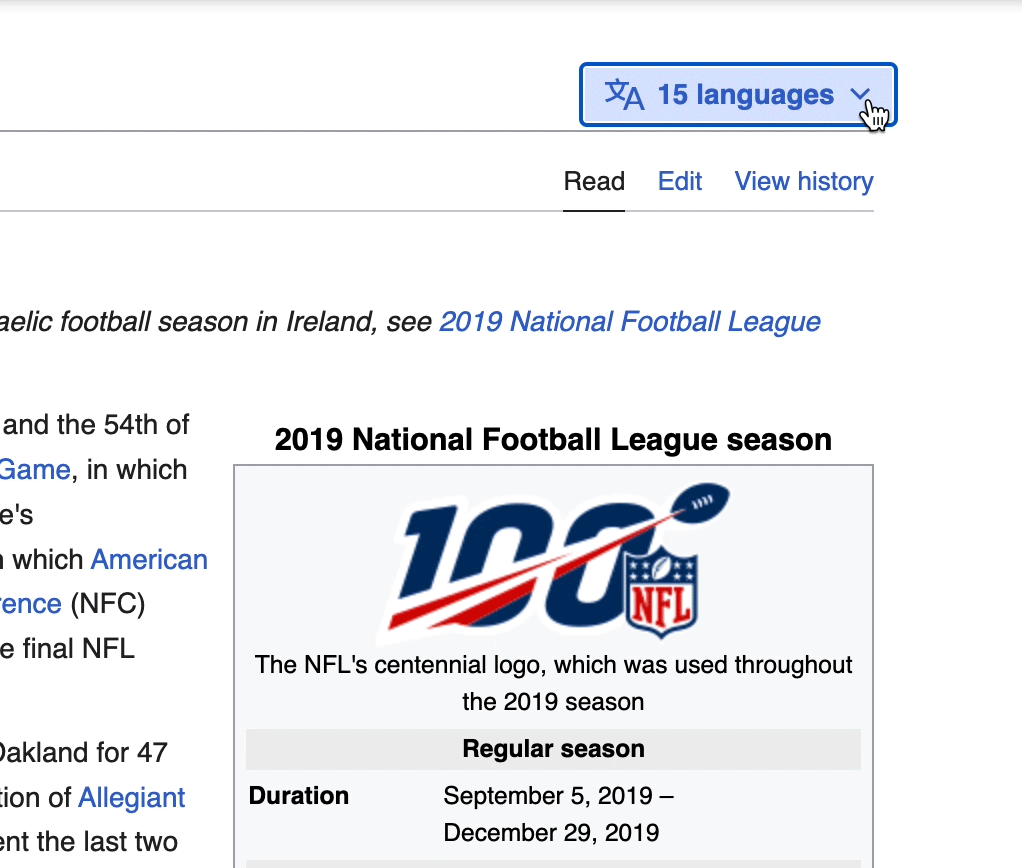
4. Language switching
Simply put, information is universal, and the community is global, so this feature makes it much easier to change languages on any given page.
Controversy
I am a sucker for simple, straightforward design choices, especially when something has been refined and paired down in order to access and understand information more clearly. So, consider me a fan of the new rollout. I had a natural inclination to see if other people agreed with me.
And for the most part, they didn’t.
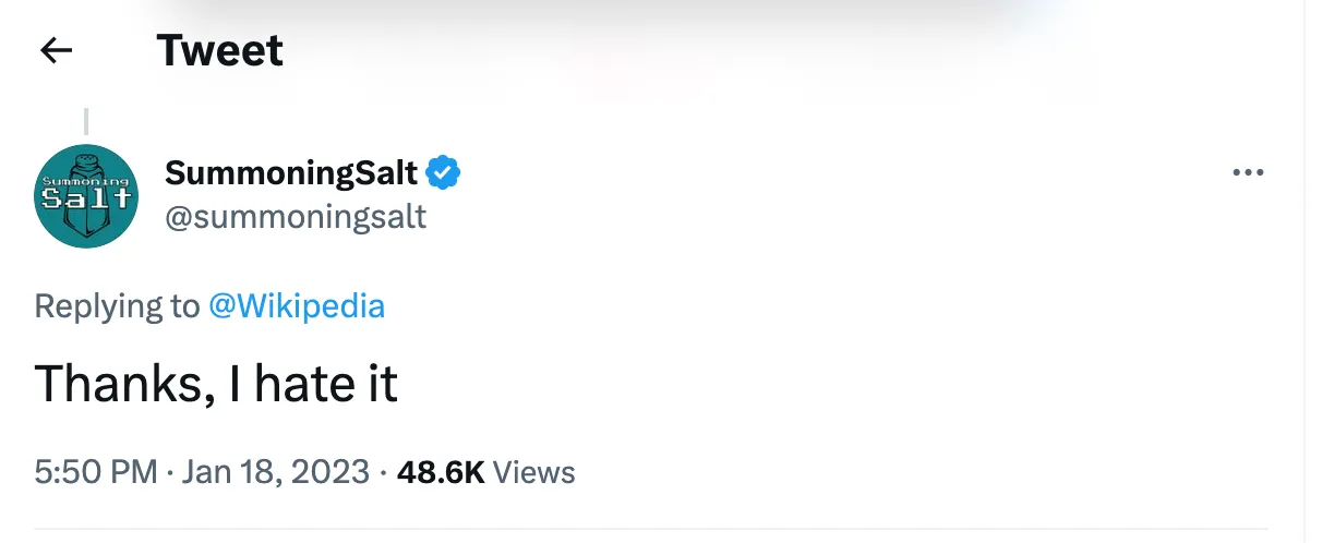
There are plenty of other tweets like this one that share this sentiment — expressing general displeasure of the new update, or imploring Wikipedia to revert it back to its former layout (which, by the way, you can). As I’ve written about before, people don’t like change. But more often than not, people get used to it, or quickly adjust their expectations and move on.
Conclusion
Wikipedia has merged its classic web 1.0 values (free information that belongs to everyone), with a web 2.0 feel (overall improved modern usability). And that’s a great call. While the rest of the tech world sprints down all kinds of new paths (including more than a few dead ends), Wikimedia is sticking with the approach that has worked for them for decades.
The four examples of its new design features above are a direct extension of those values, making sure this information is as clear and accessible as possible. There’s a reason why Wikipedia’s logo is represented as an unfinished puzzle — we’re all helping to build it together. They’re not promising a completed picture, but the new redesign certainly can help us see it.