
Vectro Type studio released a new Google Fonts-commissioned typeface last week called “Kablammo,” which is self-described with such adjectives like “hyperactive, maximalist, doodad.” When I saw it front and center on the Google Fonts homepage, I immediately thought of “Jokerman” — an infamous ‘90s-era font that used to be kitschy but now is kinda un-ironically cool.
The rollout contains a classic highly visual, vibrant, flat-out cosmic mini-site that you can easily immerse yourself in, as well as a very comprehensive blog post outlining the process of concept to fruition. It’s a fun read, and accurately describes a “creative process” that occurs across every school group project, workplace whiteboard session, or a band in a studio trying to make an album. It also demonstrates that the whole impetus for Kablammo came from a team exercise around “making a modern Jokerman.”
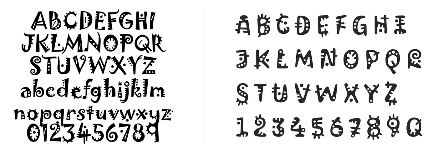
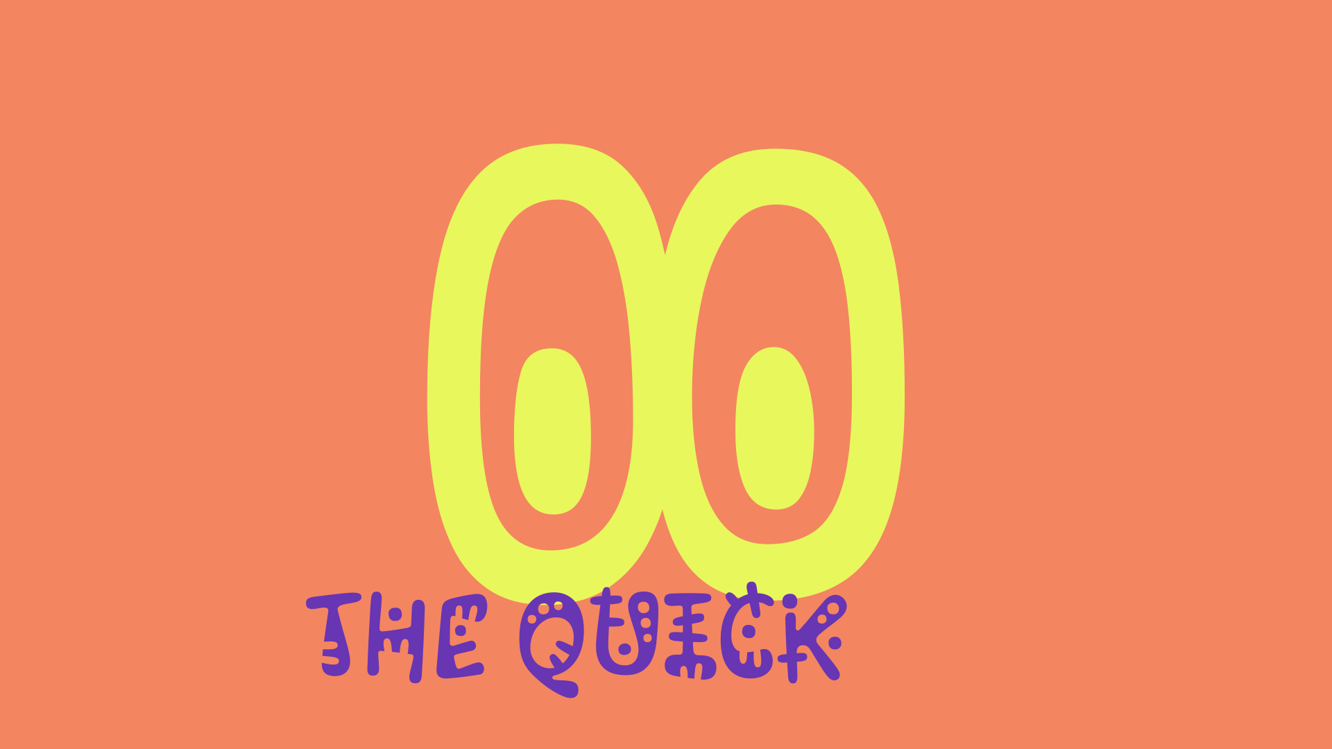
Jokerman (1995) | Kablammo (2023)
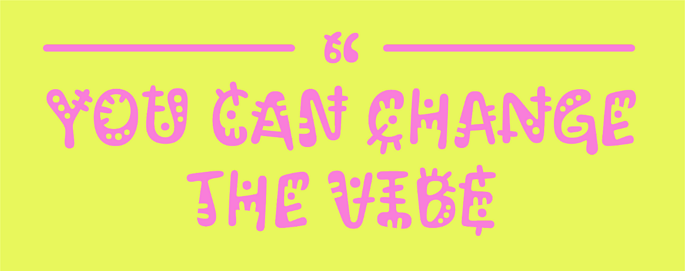
They hit the brief well. The organic lines and shapes are abundant, but don’t feel superfluous, and each character retains its integrity. Although the “J” and “R” can be a little tough to read out-of-context (but they arguably look the coolest). The lines are syrupy instead of stiff, and the angles are soft instead of rigid. As a decorative display typeface, it’s clearly having a lot of fun, and it has an inherent familiarity that makes it really palatable.
Once I assessed everything mentioned above, I was mainly left with one thought — I’m gonna start seeing this everywhere, aren’t I?
A few months ago I wrote about, in a way, the opposite. Something that you see out in the wild — in this case, another font — that you can’t help but see over and over again. (I still see Hobo everywhere, in case you were wondering. Do you?). But in this situation, we’re on the ground floor. There hasn’t been an opportunity to see it infiltrate culture, yet. So what exactly gears my premonition that I WILL see this everywhere?
There are four reasons:
1. It’s the ‘90s
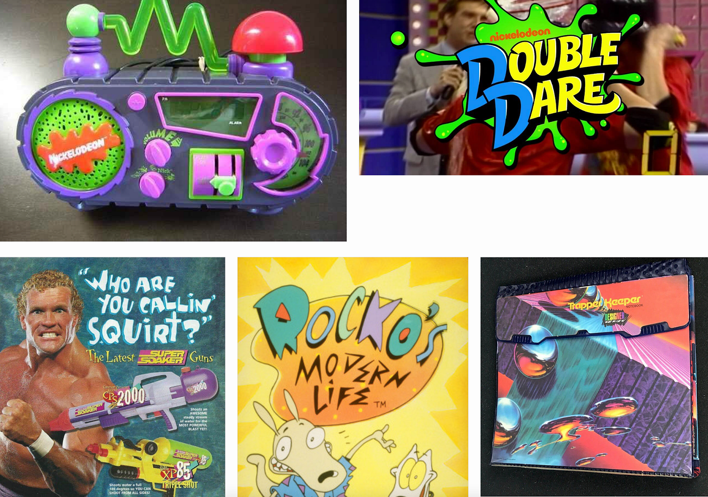
There is clear inspiration from ’90s culture — Nickelodeon, colorful plastic toys, bold design choices, kid-friendly maximalism. The name itself sounds like an onomatopoeia of what you would hear in a Micro Machines commercial (or a nod to the short-lived Nickelodeon show KaBlam). There’s an eternal admiration of ’90s aesthetics and longing for the early days of the internet. Kablammo taps into this well.
2. (but also) It’s the future
Kablammo is an open type variable font, so instead of different “weights,” there are different styles — it dances! Thin/Light/Medium/Bold is replaced with Zoink/Bloop/Splat/Eek. Rather than changing the weight of a word or phrase, you can change the vibe. As Tobias Kunisch described during his talk at Config, “fonts are software now.” It’s so much easier and more accessible to build things on the internet now, and Kablammo is one example of how variable fonts will help inspire creativity and open up more possibilities in digital environments.
3. It’s free
Kablammo is available for download right now. This is part of Google Fonts’ open font license, which means it’s completely free to download and use by anyone, for pretty much anything, including on Google Workspace. In addition to the open type nature, any designer can take this and throw it onto t-shirts, event invitations, social posts. The Kablammoptions are endless.
4. It’s a brand
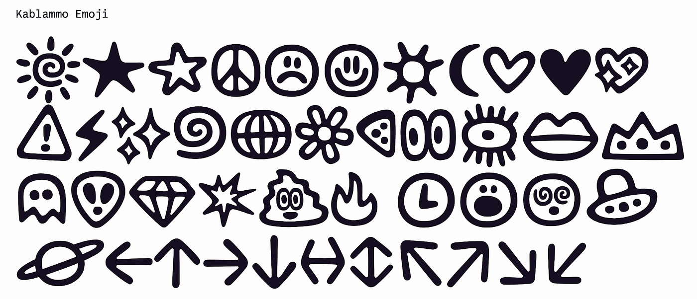
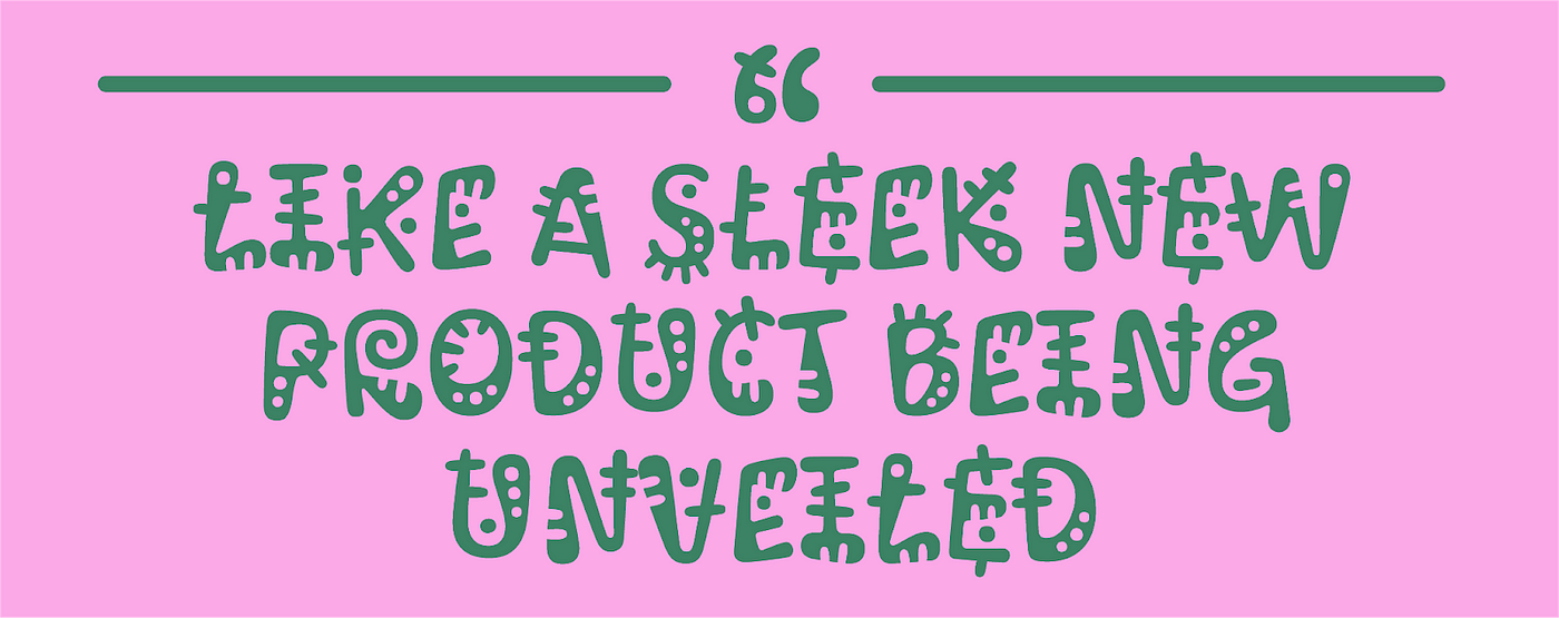
Perhaps the strongest inclination I have towards Kablammo’s inevitable rise in popularity is that it feels like a brand. I can very easily see the ecosystem built around it, mostly due to Vectro’s extensive launch materials. The mini-site feels like a unique experience, as if it was a sleek new product being unveiled. It’s more than just letters — it’s pictograms, it’s energy, it’s a personality. Fonts are self-contained visual identities, and they’re household names, and in our creator-led world, people care more about that now than they ever have.
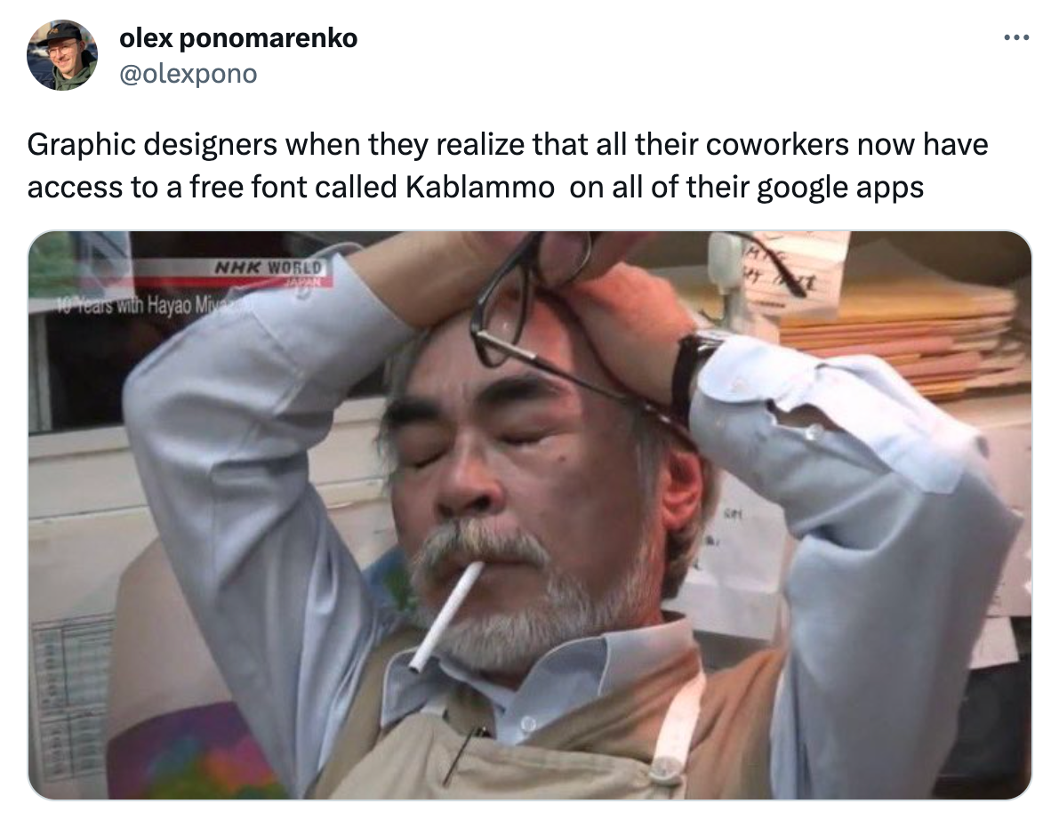
It’s too late to add to our trend predictions for 2023, but this is something I’d be willing to include as an addendum. Unlike the cigarette-wielding subject in the embedded Tweet above, I’m interested to see where it will go, how it can evolve, and what kind of personality it can bring to endless applications.