
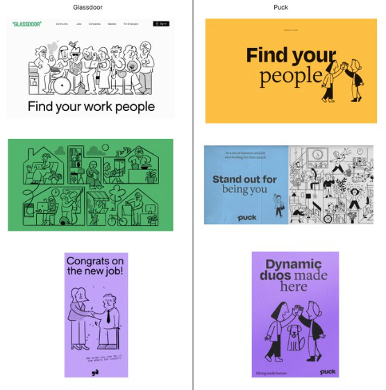
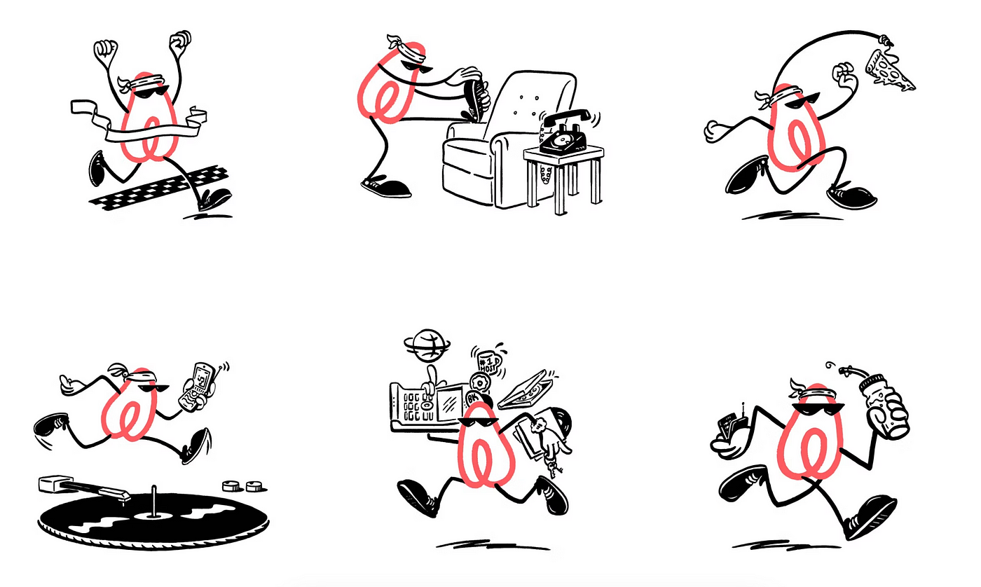
Last month, the co-founder of Puck, a hiring & employee engagement platform company, took to Twitter to point out that Glassdoor ripped off her company’s brand identity. Take a look for yourself:
Source: Twitter
This took the design community for a spin around the typical reaction cycles, from the wow-how-blatant, to the well-actually-you-don’t-own-this-illustration-style, to the ultimate go-to 2023 online proclamation that “this thread is depressing.”
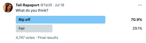
The consensus, at least the ~5000 votes on Tali Rapaport’s poll, seemed to agree with her.
Source: Twitter
Now, the side-by-side comparison is conveniently cherry-picked, but it’s hard to ignore the uncanny similarities — imagery, colors, characters, even the copy. There’s no doubt the design outfit at Glassdoor at least had Puck on a moodboard, or took a competitive analysis that inadvertently bled into their final output.
Beyond Puck and Glassdoor though, this is definitely a trend that’s been happening with a lot of modern brands and organizations, and how they represent themselves visually — the doodle-y folk are overtaking the vector-y folk.
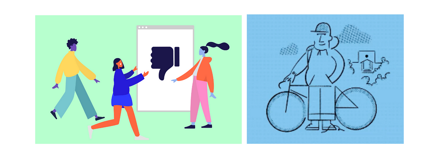
Vector-y folk (Corporate Memphis) | Doodle-y folk (Charliecore)
My team and I have worked with the “Corporate Memphis” style of visual design on many different projects over the past decade. Faceless characters with sleek put purposefully unrealistic shapes, flawless hair, bright colored clothes and even brighter colored skin. The vector-y folk.
This style was abundant in the 2010s, you could find many variations of these digital beings galavanting across various paid social posts, whitepaper reports, slide decks, animated videos. They’re a couple steps above clip art, but a couple steps below Caldecott-tier children’s book illustration. This style culminated with Facebook’s Alegria design system, which really honed in on a sleek, carefully curated playbook on what these characters should look like and how to use them.
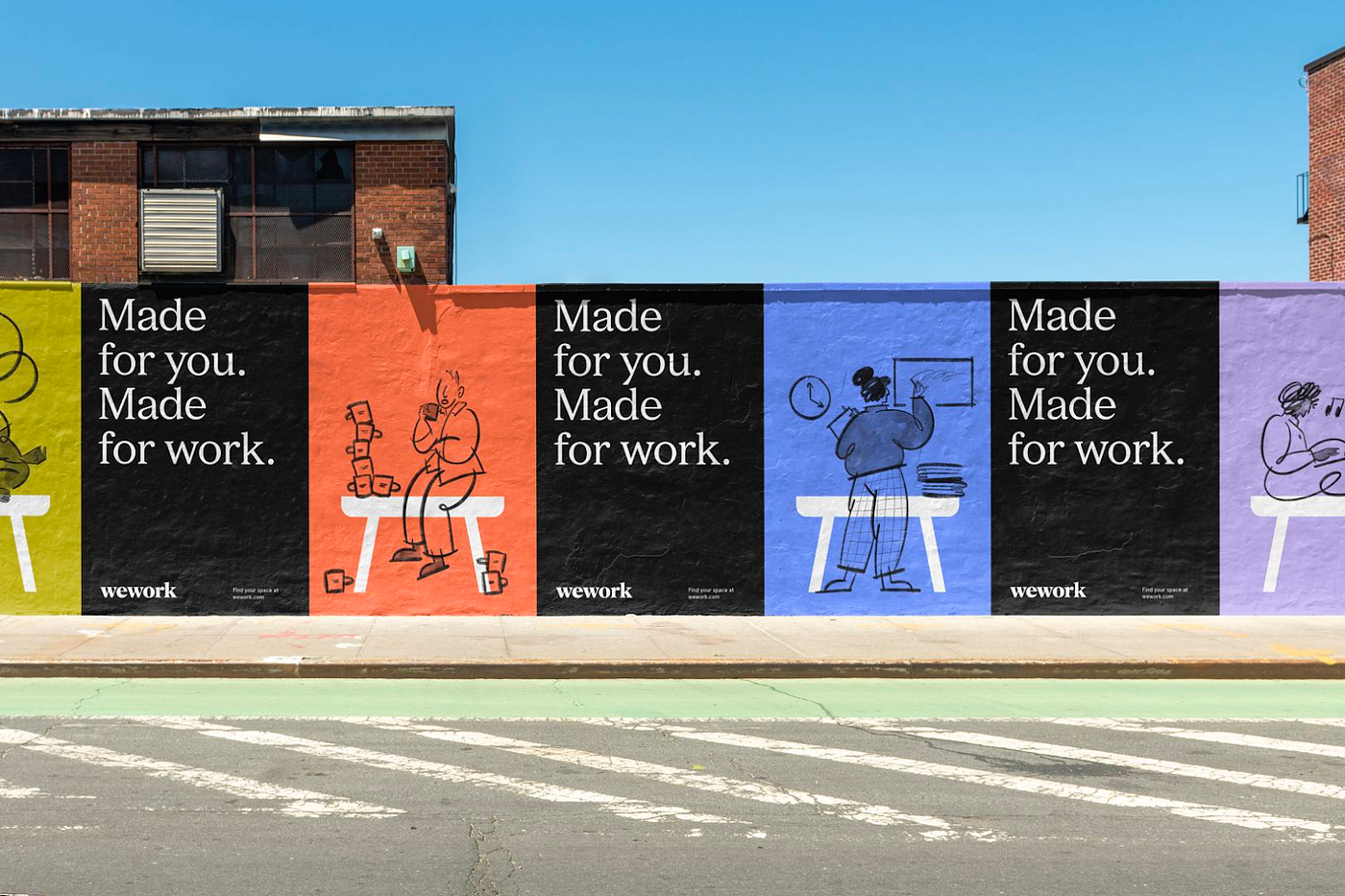
WeWork
Here’s where the doodle-y folk come in. The flat design style that could be easily replicated in Illustrator was replaced with a more organic, hand-drawn approach that ultimately seemed a little friendlier. Countless brands were launching with these visual identities, or pivoting to the look. Out with the faceless tech mascots, in with something much more innocent. Not unlike, say, the classic Peanuts comic strip. I hadn’t seen this category of visual representation coined yet so I decided to do it myself: Charliecore.
Perhaps it’s the algorithm sinkhole that I’ve found myself wading in, but Charlie Brown is having a moment around the internet. “Peanuts out of context,” a Snoopy of the day Tumblr (I haven’t given up on Tumblr yet). There was even a mini craze a few years back where people could “Peanutize” themselves — generating a modern, 3D version of your image as one of Charlie Brown’s buddies.

Notion
It’s hard to argue against Charlie Brown. He reminds us of childhood, a more innocent time in life, maybe the warmth of the holiday season. Even Chuck’s ‘aw shucks’ self-deprecating mindset was an early foreshadowing of the 21st century extremely online persona. Reading Peanuts comic strips in newspapers across the country decades ago was as ubiquitous as witnessing brands attempting to capture our attention today.
I’m unsure if there was a line-in-the-sand moment when the shift toward Charliecore started, but the Corporate Memphis folks of yesteryear are gradually and noticeably disappearing. As brands grappled with the reckoning that they can’t just sell products and services to people, they need people to love them as well. This visual identity displays a more palatable personality, a sense of humor.
Airbnb
FastCompany wrote about Mailchimp’s brand identity in 2018 and acknowledged their attempt to “keep it quirky.” They wrote about the style: “That winking humor, along with playful illustrations that are meant to demystify what a tech company does.” A strategist at Collins, the agency that rebranded Mailchimp, also went on to describe why the visual shift was necessary — ”The trajectory of every company is that you’re quirky, friendly, approachable, and when you become a massive company with a lot of employees, you become austere, sterile.” This insight, that a brand’s rapid growth can have adverse effects on the way it’s perceived, is certainly a motivating force to spark an identity change.
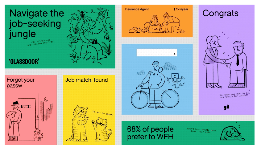
Glassdoor
There’s a creative rationale behind this style as well. Similar to Corporate Memphis, it’s much easier to draw these scenes of people & environments than staging photography with real people and sets, which end up looking too much like stock. The style also lends itself well to a diversity of representation in body shapes, hair, and facial expressions that really capture a distinct personality.
The “friendly, approachable, and playful” concept takes the form of, simply put, drawings — something so deeply and inherently human, a widely accessible and freeing art form that people have been pursuing since the advent of the planet. Like a doodle in the margins of your notebook, or a notorious comic-strip-turned-cultural phenomenon, it conjures up happiness.
Mailchimp
So did Glassdoor rip off Puck? It sure feels like a rip off (or an homage, if you’re feeling generous). The audiences and brands’ missions are similar after all. Beyond this specific head-to-head comparison here, though, Charliecore has permeated itself in a lot of different places and consumer environments, and it’s here to stay.
Until, that is, brands find another friendly visual identity and pull the football out from under us.