
Over the past year, I’ve been seeing the same font everywhere, haunting my gaze at every turn. It’s on posters, album covers, daycare center signage, food labels, on t-shirts, both on trendy Instagram accounts and in the depths of the TJ Maxx sales racks. You name it, this typeface appears there. Clearly so ubiquitous, and oddly so familiar.
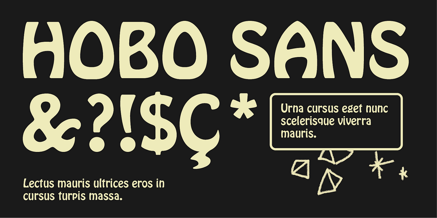
I couldn’t put my finger on it, but I knew I’d seen it around before. The font seemed akin to some funky selection on a classic word processor, a la Papyrus, Comic Sans, even a Jokerman — the fonts that have become punchlines in the 21st century. It evoked some kind of feeling. Its bold letters, child-like features, the specific curves, the bounce that each character had, the angles that sort of look like puzzle pieces. The way the capital T looked like a palm tree.
I spotted it on the side of a service truck double-parked on a New York City street and decided I needed to capture the evidence.

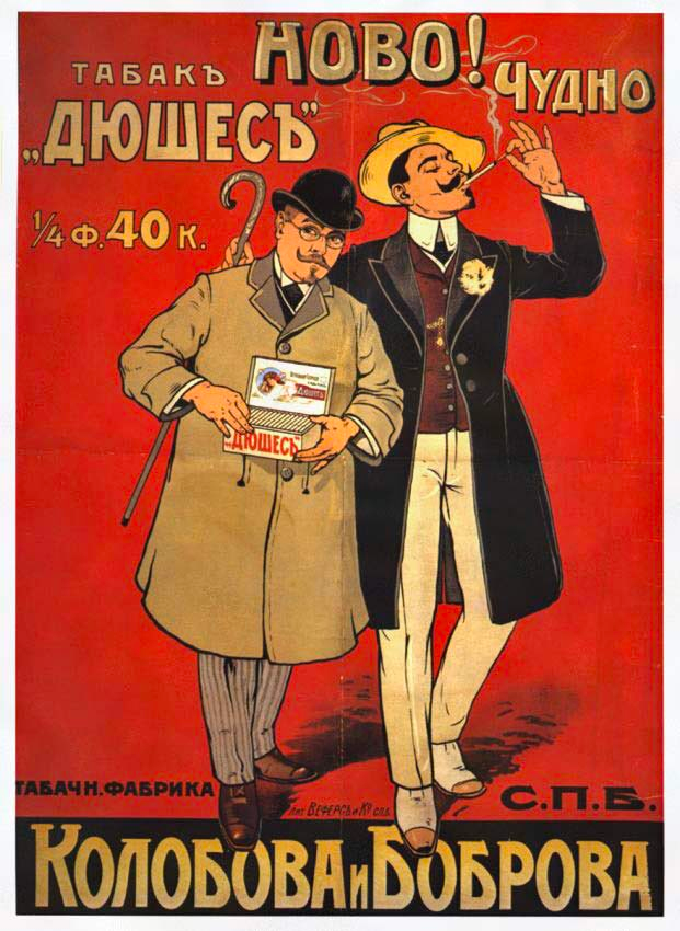
After a quick reverse image search on that image, I discovered the typeface in question was Hobo, a sans-serif font dating all the way back to 1910. Its origin story is fascinating, especially as to why it’s called “Hobo” to begin with. It’s alleged that designer Morris F. Benton, a heavy smoker, saw the word on top of a Russian tobacco poster, which shares a similar shape to the very type design that he went on to develop. See for yourself:
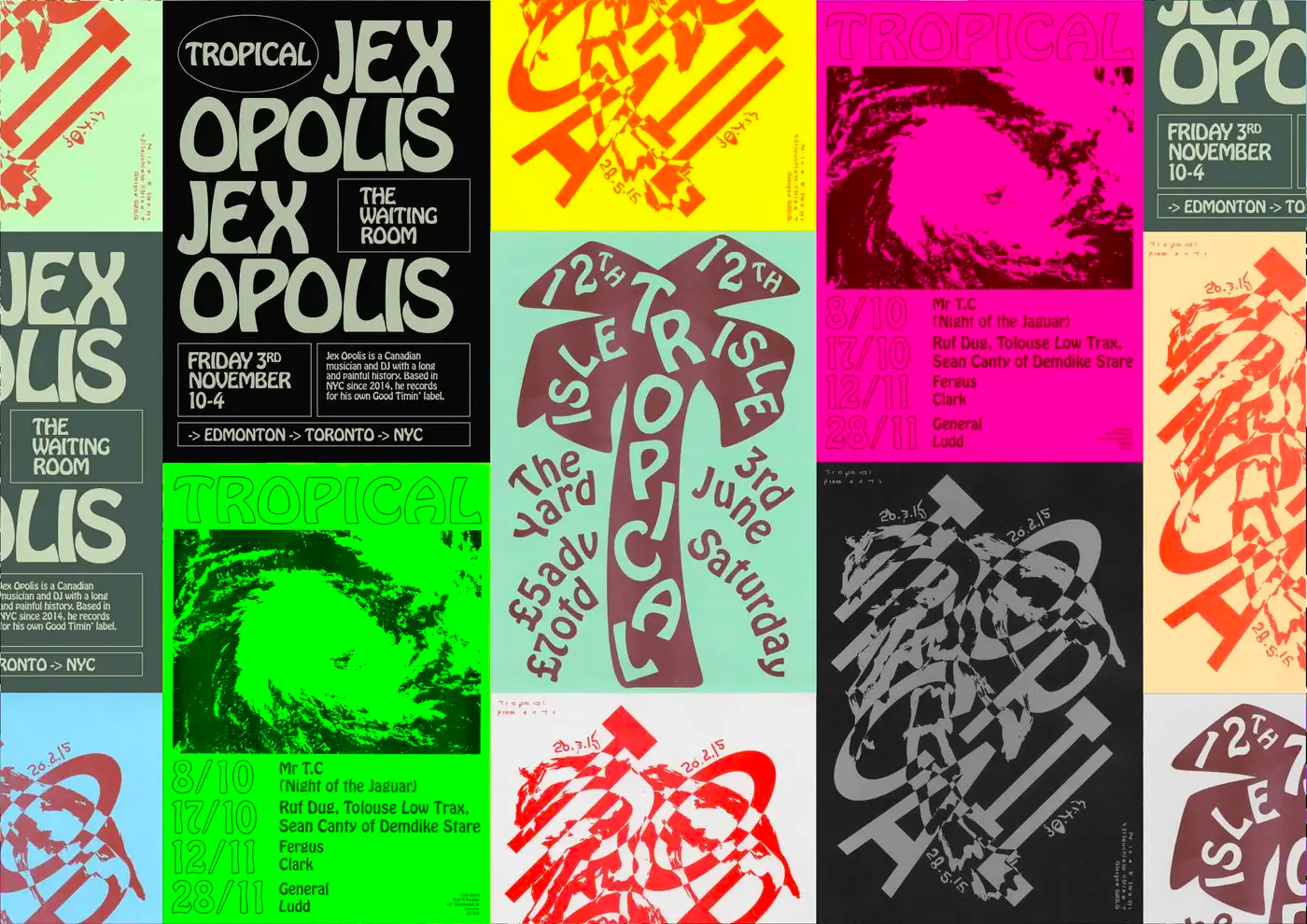
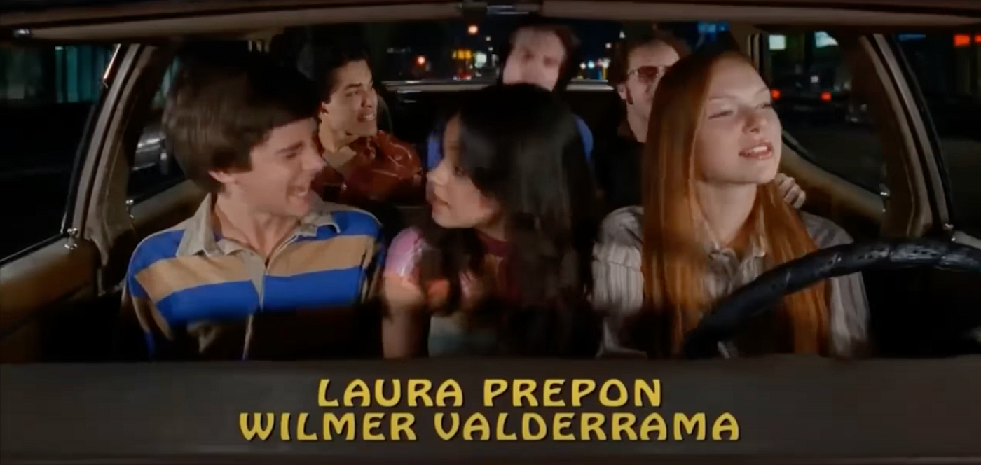
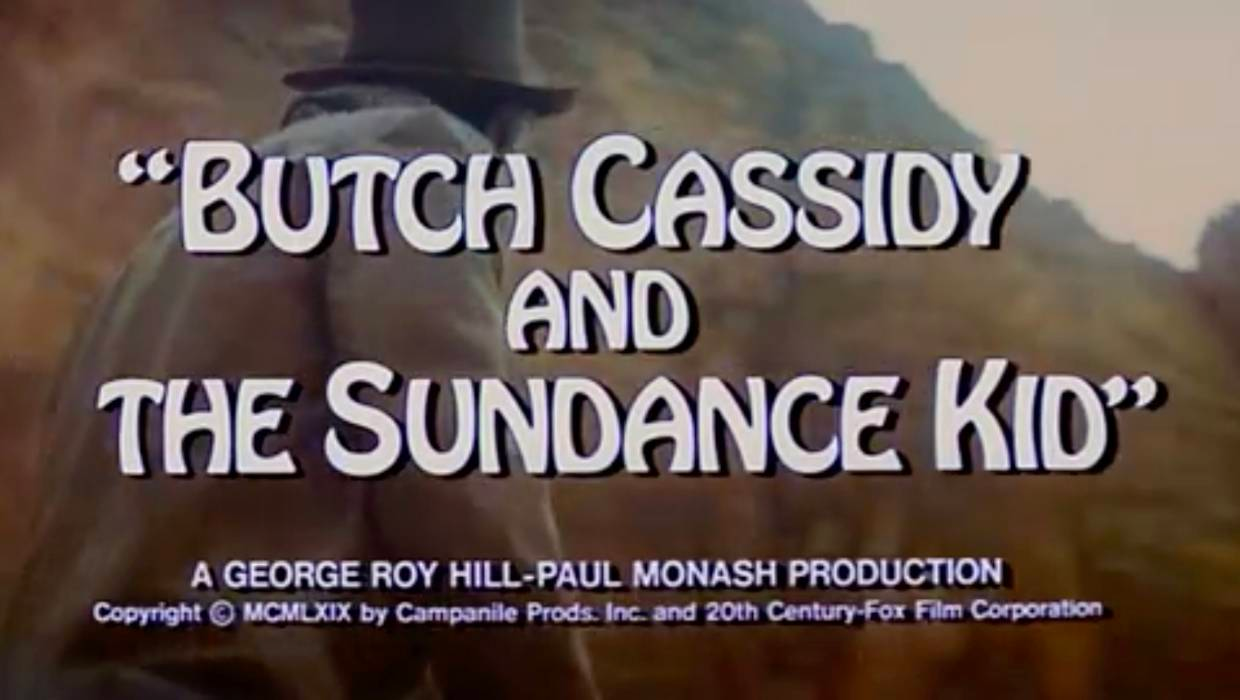
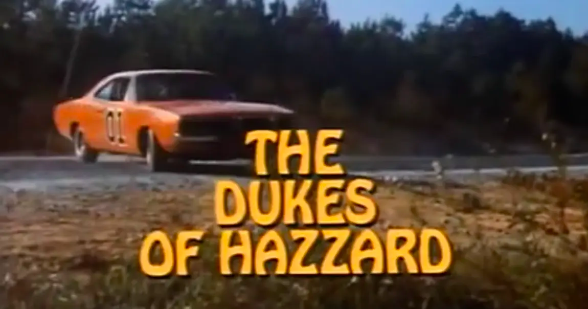
Looking further into where it’s been used, I saw a lot of 70s ephemera — album covers, movie posters, proto-health & wellness food packaging, even the title credits for That 70s Show. And it started to become clear, the sensibility of the typeface felt groovy, wavy, like each letter could pull off wearing bell bottom pants or a psychedelic floral pattern. But there’s something else about this font that goes beyond a simple old-school nostalgia play.
I continued to poke around the internet to see if anyone else has witnessed an uptick. I realized more places I’d seen it — the Once Upon A Time In Hollywood movie poster, bags of Stumptown’s coffee beans. There was a Tumblr page dedicated to the font’s usage in the wild, a classic early 2010s method of disseminating the long tail of pop culture artifacts. An Instagram account whose handle tells you all you need to know about its point of view. And naturally, strong feelings about Hobo from designers on Twitter.
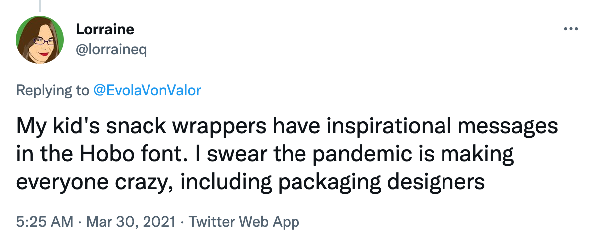
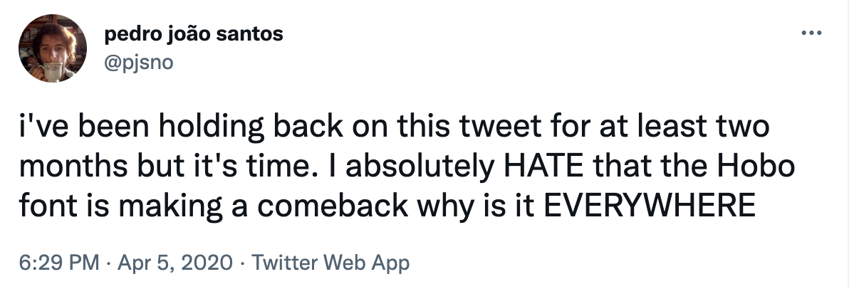

Aside from the fact that designers have strong feelings about pretty much anything that crosses their eyes, there’s a bitterness that looms underneath these tweets. But most importantly, you can see the vivid reactions, not too dissimilar to my experience, and why I’m writing this very article.
So why am I seeing it everywhere? I can narrow it down to roughly five reasons:
1. It’s fun and silly 🤪
Its zany-looking letters give levity to all sorts of content. It’s a way to show “hey, I like having fun, and this world is a dark place, so don’t take me too seriously!”
2. It’s accessible
All cheesiness aside, it’s bold, the shapes of its letters are easily distinguishable from one another, and it’s easy to read. It’s also available through various type foundries including Adobe, so anyone with a Creative Cloud license can go buck wild.
3. Bon Iver
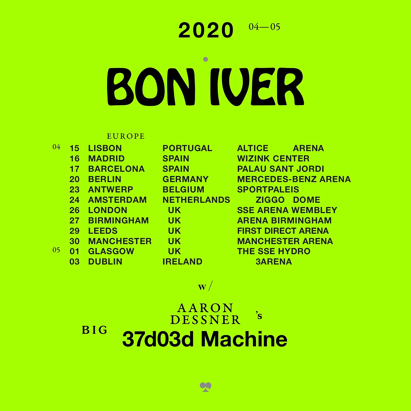
Around 2019, music artist Bon Iver started stylizing the band name with Hobo in various posts regarding upcoming tour dates. Their fans also had visceral reactions to the usage of the typeface. Could a popular and critically acclaimed musical act have summoned the font back to our modern day?
4. The Baader-Meinhof effect
After noticing something for the first time, there is a tendency to notice it more often, leading to an illusion of an increased frequency. Am I seeing it around more because it is becoming popular? Or am I seeing it more because I can’t help but notice it more? 🤯. Which segues to the last reason.
5. Familiarity
Ok, here’s where I think the top answer is. It’s been around for 100+ years and has been used across countless pieces of visual media. It’s familiar with people, the same way it was for me.
There’s a comfort in familiarity, like going to your grandmother’s house that still has the same carpet from 1972. Sure, there’s weird stains and it’s discolored, but it’s part of the fabric of your grandmother’s house, and you’d miss it if it was gone.
Visuals evoke feelings, good or bad. As I mentioned at the top, I can’t help but notice it everywhere, I spend mental energy thinking back to all the places I’ve seen it. I felt something when I kept seeing it. Olympic viewers felt something when they noticed the backs of South Africa’s team jackets. Morris Benton felt something when looking at that Russian tobacco poster.
Fonts especially evoke lots of thoughts and feelings in the postmodernist 21st century. It’s so easy to clown on Papyrus, but if you’re out to dinner at an Italian-American Enoteca and the wine list is covered in it, you know deep down that a relaxing meal and delicious Chianti awaits you. Sifting past the snarky opinions about Hobo that exist online, it’s clear that people at least give a damn.
We’re conditioned to recognize patterns. Patterns are familiar, repeated ideas are familiar. ‘Memes’ — the visual format that rule our daily lives — in their most primitive forms deal with imitating a relatable idea and pattern. Designers and visual artists rely on patterns to organize information. UI designers rely on patterns for usability, and to establish hierarchies.
Hobo is just another one of these memetic patterns. I felt that it’s been following me around because in some ways, it has, but more specifically, I’ve been looking for it, just like what the Baader-Meinhof effect states. Ever see the same number over and over again? Clocks, cash registers, building unit numbers, the more you attach significance to seeing it, the more you’ll see it. Since I’ve been actively thinking about Hobo, it continues to inundate my lines of sight. There it is on a sign at the dry-cleaners, and again on a package of tortillas, and again on a record sleeve at a flea market.
I wish I could remember the first instance that triggered this rabbit hole. In some ways it doesn’t matter, just like any of the other familiar patterns that are with us day to day. In terms of my design-related opinion, the jury’s still out. Do I hate it? Of course not. Would I use it in my work? In the right context, sure. I’ll surf that memetic wave if it makes sense. I suppose all I can say is that Hobo quite simply struck a chord, and it remains to be seen what kind of chord that is — perhaps a lush G-chord from the last Bon Iver album.