Let’s start here: The espresso martini might be the rebrand of the century.
One, it is not an actual martini (there’s no gin or vermouth 🤯), and two, someone was chaotic enough to think that caffeine and alcohol would make a classy, synergistic union even after the anarchy of Red Bull vodkas.
If you’re here to read about espresso martinis, you’re both in, and out, of luck. This is the story of a client rebrand.
The client is us. Codeword has been working behind the scenes with your favorite tech brands for more than a decade. At our core, we’ve always had this secretive vibe (it’s even in our name). A brand that only existed in email threads. Coffee chats. The group text. Where the word-of-mouth brand-building happens.
And we liked that. It felt sexy and mysterious and cool.
But what if? What if we made our brand just a bit…louder?
Remember the espresso martini? What if we took that proverbial shaker, filled it with chaotic creator energy, and added a couple ounces of digital marketing innovation?
So that’s exactly what we did. And it starts with a fresh positioning line. :Enter parting of clouds: :Cue blowing of horns and heavenly choir:
Codeword is an agency of creative builders that wants to create experiences people care about. And we know, as marketers, we have the power to fill the internet with beautiful things.
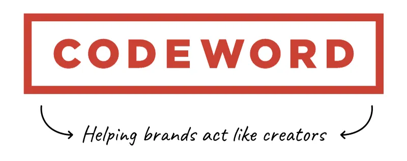
And we bring that energy to our clients. We help brands act like creators.
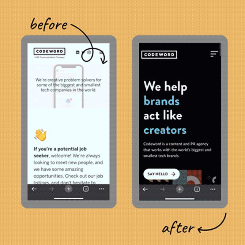
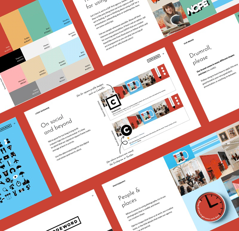
From a design perspective, that looks a little something like this:
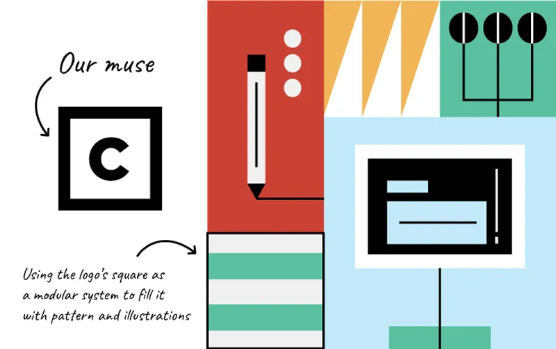
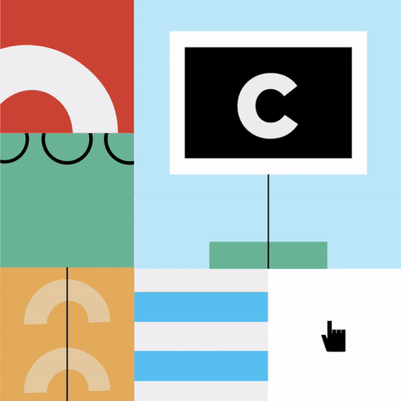
The new visual ID is our foray into this already familiar digital space. It hinges on a visual system of modules and shapes all derived from 👏 our 👏very 👏 own 👏 logo 👏.
This is our way of creating something real and original, but also coded and just a bit secretive. We even have dark mode — take a look at it on our shiny new website.
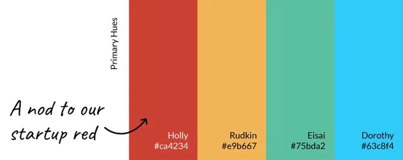
To get into the weeds a bit, every aspect of our look was considered with our creator hat on. To start, our color palette is vibrant and tells a brief history of the agency.
We bring back THE founding agency red and other institutional hues from when Codeword (aka Knock Twice 🤫) first opened up shop, and pair it with shades representing our partnership with WE Communications. We even named our colors after creators! Our red is named Holly, after Birdsill Holly, the inventor of the iconic red fire hydrant (yes, we can help you in your time of need), and our Yellow is named Rudkin after Margaret Rudkin, the inventor of Goldfish Snacks (we will always, always continue to create snackable content that everyone will love).
We continue to tread boldly with our origin story and take inspiration from our square logo. The square is reimagined as a module, and it’s the perfect blank canvas for our team to fill with our core shapes to create anything and everything imaginable.
The result is a look and feel with endless patterns and illustrations as unique as our voices and ideas. This glossy new system tells a big story up close, but an even bigger picture from afar.
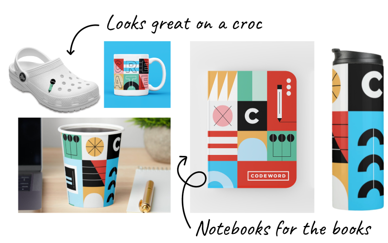
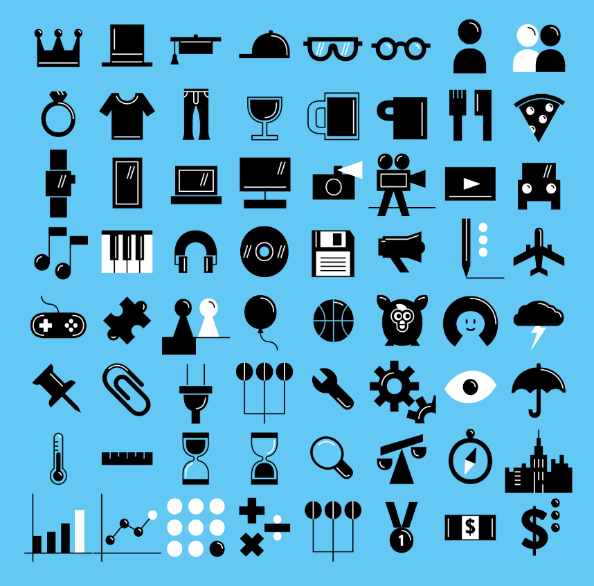
Lastly, and like the rest of the toolkit, our signature icons are built from our brand logo shapes. When we say we’re applying this visual system throughout, we truly are.
And ultimately, our new design system hinges on our people. A testament and a belief that we hold near and dear to our wired hearts: The best creative work comes from the minds of not one, but many.
It took one full design team, many writers, strategists, and some very crunchy timelines to get it all on paper and ready to reveal it to you.
At the end of the day, we’re blending the chaos of the digital marketing industry with the chaos of the creator internet. Blending caffeine and alcohol into our own visual version of the espresso martini. A top shelf vision we hope you enjoy shaken, not stirred, with just a bit of foam and a thirst to see what we have in store for the future.
Espresso rebrand
If you want to make your brand feel like a creator, think about whipping this up alongside a marketing plan, or serve it right before a big industry activation (like we did at SXSW).
Ingredients:
1 company vision
1 liberal pour of customer insight
3 core values
More than a decade of team culture and lore
Directions:
1. Stir it together until you have a strong positioning line.
2. Lay out your mood boards on the counter.
3. Fill the cocktail shaker with ice then add a gallon of creative energy (make sure you don’t skimp out!).
4. Add colors, font choices, and sample slide templates.
5. Invent clever branded merch (very important!).
6. Shake.
7. Strain out the bits that don’t serve your mission.
8. Top with a buzzy creds deck and serve immediately.
Cheers to the hard work of our creative team, and to you for sticking with us through all these years!
Love,